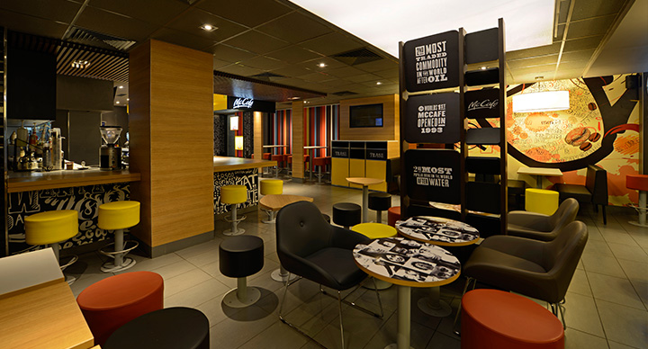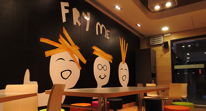
If you are an old McDonald’s customer, you must have noticed that a few years back, the look and feel of McDonald’s restaurants went through a major transformation. While the vibrant hues and the “Forever Young” theme were not disturbed, there was something very modern and edgy about the new interiors.
Behind those soft lights, colourful chairs and modern illustrations are Lewis & Hickey. With over 100 years of experience, Lewis & Hickey has given McDonald’s and McCafe outlets a local touch while keeping the international look and feel intact.

It was in 2013 when McDonald’s planned to introduce its internationally successful McCafe brand into India, that the engagement between the McDonald’s India and Lewis & Hickey went a step further. After having created 50 design builds across India and Europe, Lewis & Hickey was awarded with the task of integrating the café format with the ‘family restaurant’ image of McDonald’s.
The result was for everyone to see – floating light boxes, lounge seating, bar stools and fancy wall graphic language that make for a great visual appeal. The unique new designs and the refurbished ambience have transformed McDonald’s into a hangout zone for people cutting across age groups.


